Heatmap is a graphical representation of data in which values are depicted by colour. It is also defined by the name of the shading matrix.
A heatmap is a plot of rectangular data as a colour-encoded matrix.
It is defined as the graphical representation of data using colours to visualize the value of the matrix.
Here to represent more common values with brighter color and darker color are preferred to represent less common values.
Syntax
seaborn.heatmap(data, *, vmin=None, vmax=None, cmap=None, center=None, robust=False,
 annot=None, fmt='.2g', annot_kws=None, linewidths=0, linecolor='white', cbar=True,
cbar_kws=None, cbar_ax=None, square=False, xticklabels='auto', yticklabels='auto',
mask=None, ax=None, **kwargs)
Parameters:
- data: It is a 2-D dataset that can be coerced into a ndarray.
- vmin, vmax: Values used for anchoring the colormap, otherwise they can be inferred from the data and other keyword arguments.
- cmap: It is used for the mapping from data values to color space.
- robust: It is a bool value and If True, vmax and vmin are avoided.
- fmt: It is used string formatting code to use when adding annotations.
- linecolor: It is the color of the lines that will divide each cell.
Examples
import pandas as pd
import matplotlib.pyplot as plt
import seaborn as sns


data=sns.load_dataset("mpg")
data.shapeOutput:
(398, 9)
Plotting Heatmap using pivot
#using pivot
data_Piv = data.pivot_table(index='cylinders',columns='origin',values='model_year')
data_Piv
Output:
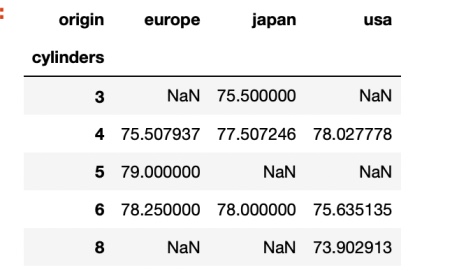
data_Piv.shapeOutput:
(5, 3)
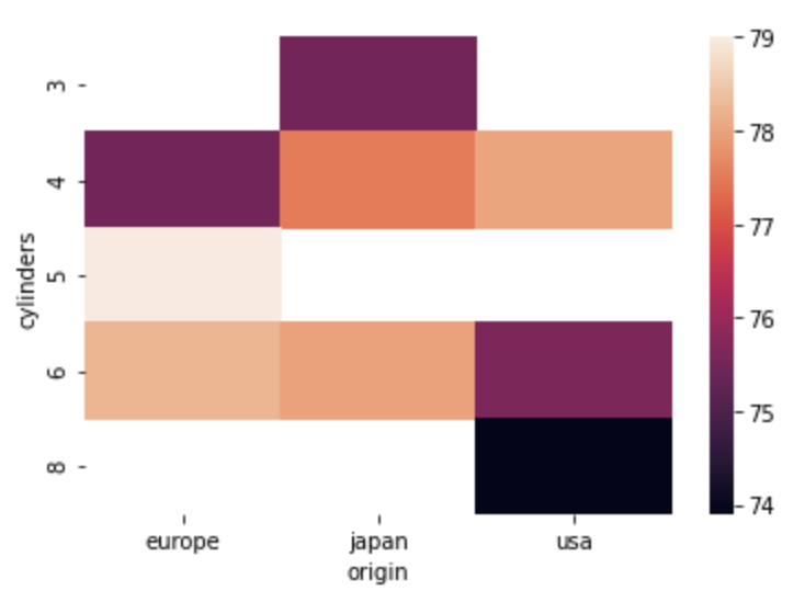
#simple heat map
sns.heatmap(data_Piv)
Output:
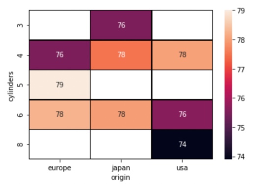
#styling of heatmap
sns.heatmap(data_Piv,annot=True, linewidth=0.5,linecolor='black')
Output:
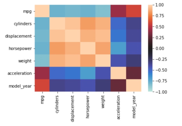
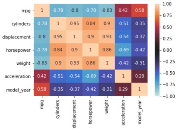
Plotting Heatmap using correlation:
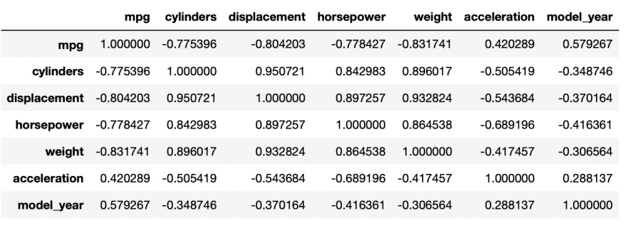
#using correlation
data_1=data.corr()
data_1
Output:
sns.heatmap(data_1,vmax=1,vmin=-1,center=0)Output:
sns.heatmap(data_1,vmax=1,vmin=-1,center=0,annot=True)Output:
- Log in to post comments