It is a subplot grid that is used for plotting the pairwise relationships in datasets. In comparison to pairplot it is more flexible.
Pairgrid maps each variable in a dataset on a column and row which is a grid of multiple axes. Then there are different types of axes-level plotting functions which are used for drawing the bivariate plot in the upper and lower triangle and the marginal distribution of each variable are on the diagonals.
Here we can also use the hue parameter to represent an additional level of conditions which plots different subplots with different colors.
Syntax
seaborn.PairGrid( **kwargs)PairGrid has many arguments that can be used for inputs some of them are described below:
- data: It is a type of long-form of dataframe whose each column is a variable and each row is an observation.
- hue: It is a variable in data that is used to map plot aspects with different colors.
- vars: It is a variable in data to use otherwise each column with a numeric datatype.
- despin: It is a boolean value that is used to remove the top and right spines from the plots.
- dropna: It is also a boolean value that is used to drop the missing or null values before plotting.
Example
import pandas as pd
import matplotlib.pyplot as plt
import seaborn as sns
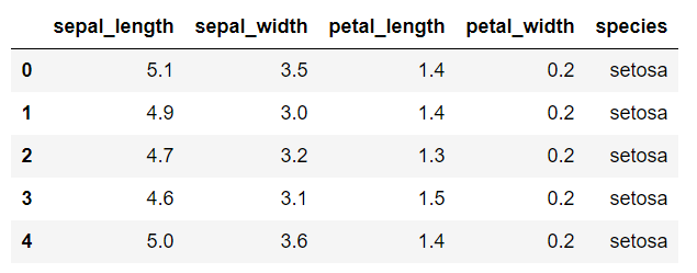
data=sns.load_dataset('iris')
data.head()
Output:
Now we will create a simple pairgrid
sns.PairGrid(data)
Output:
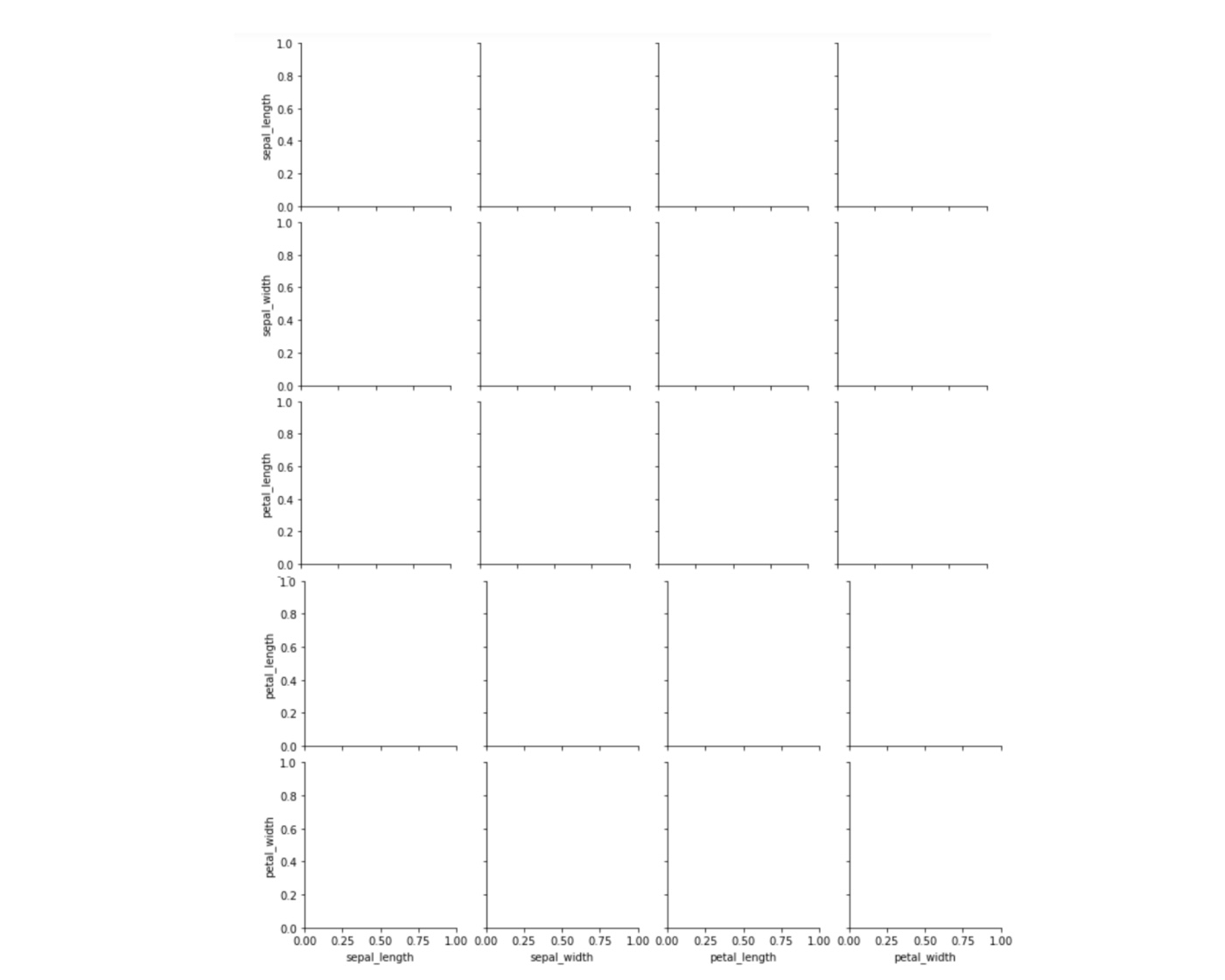
Here, In output we can see empty grids this is what pairgrid function does. It simply returns an empty set of grids for all the features in the dataset.
Now, we will call map function on the object returned by the pairgrid function and pass it the type of plot that we want to draw on the grids.
grids=sns.PairGrid(data)
grids.map(plt.scatter)
Output:
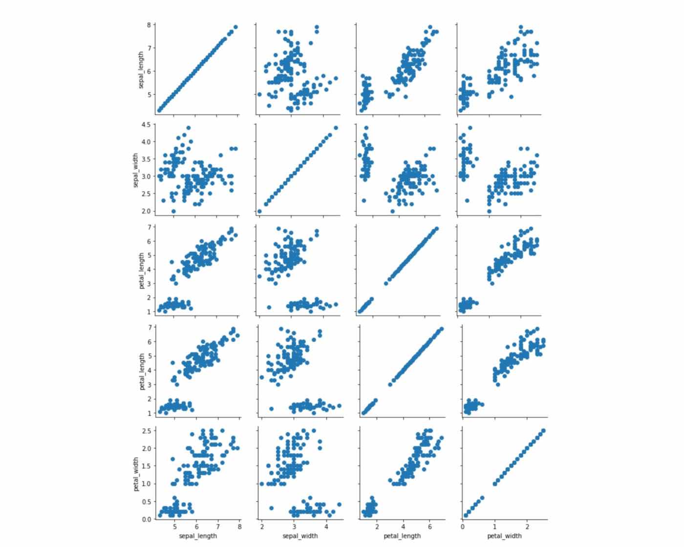
From the above output we can observe scatter plots for all the combinations of numeric columns in the "iris" dataset.
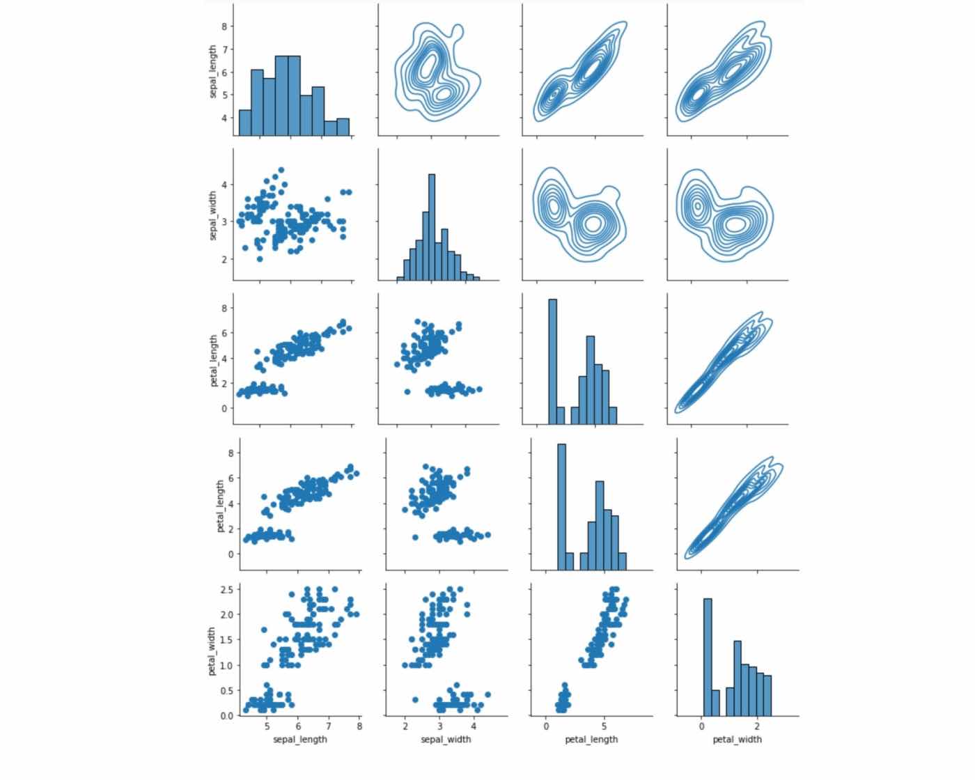
We can also plot different types of graphs on the same pairgrid. For example, if we want to plot a histogram on the diagonal, kdeplot on the upper half of the diagonal, and scatter plot on the lower part of the diagonal we can use map_diagonal, map_upper, and map_lower functions, respectively.
grids=sns.PairGrid(data)
grids.map_diag(sns.histplot)
grids.map_upper(sns.kdeplot)
grids.map_lower(plt.scatter)
Output:
- Log in to post comments