While working on data visualization our goal is to communicate insight properly found in the given data. So while we communicate the important information, styling will and influence how our audience understands the insight that we're trying to convey.
As visualizations are the centre to communicate quantitatively insights to an audience, and it is even more necessary to have figures that catch the attention and draw a viewer in.
Matplotlib Package is highly customizable, but it is hard to know what settings to tweak settings to achieve an attractive plot.
In Seaborn, there is a number of customized themes and a high-level interface for controlling the look of matplotlib figures.
After you have done with the formation and visualization part, Then the last step is to do styling. You can customize the overall look of your figure, using background colors, grids, spines, and ticks, scale plots for different contexts, such as presentations and reports.
Here we will explore three main aspects of customising that is background color, grids, and spines. We will see how these changes can change the meaning of visualization.
Examples
Import the Libraries
import numpy as np
import seaborn as sns
import matplotlib.pyplot as plt
import pandas as pd
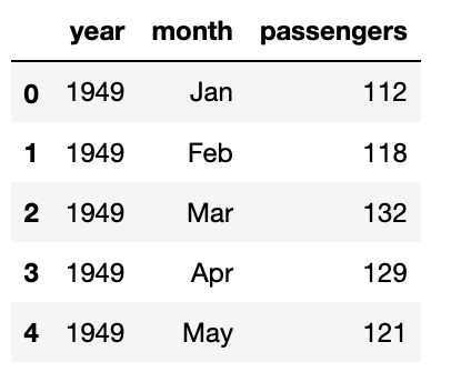
#Here we will use the datasets which are present by default in the seaborn
data= sns.load_dataset('flights')
data.head(5)
Output:
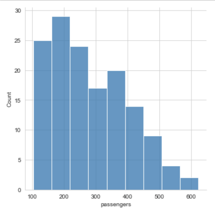
Customising Background
Using whitegrids:
sns.set_style('whitegrid')
sns.displot(x='passengers',data=data)
plt.show()
Output:
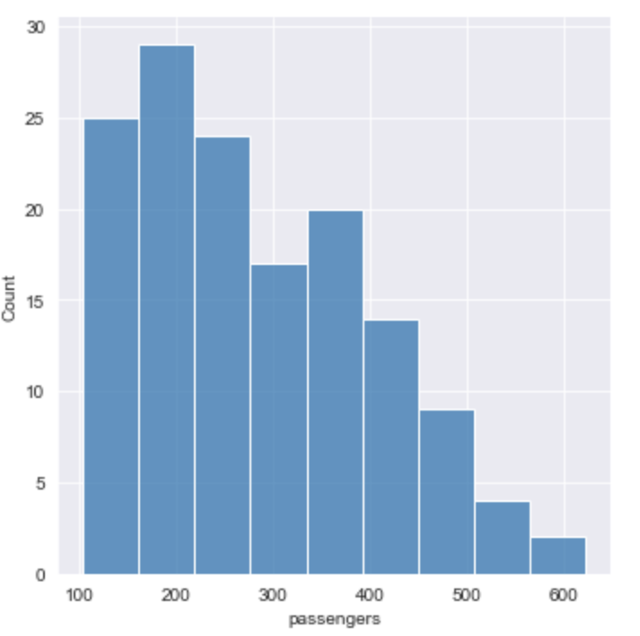
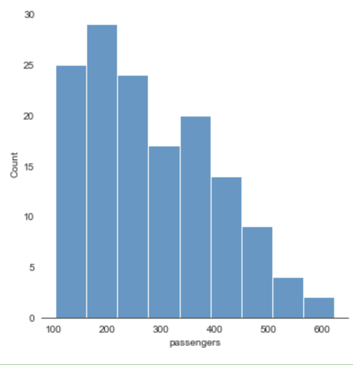
Using Darkgrid:
sns.set_style('darkgrid')
sns.displot(x='passengers',data=data)
plt.show()
Output:
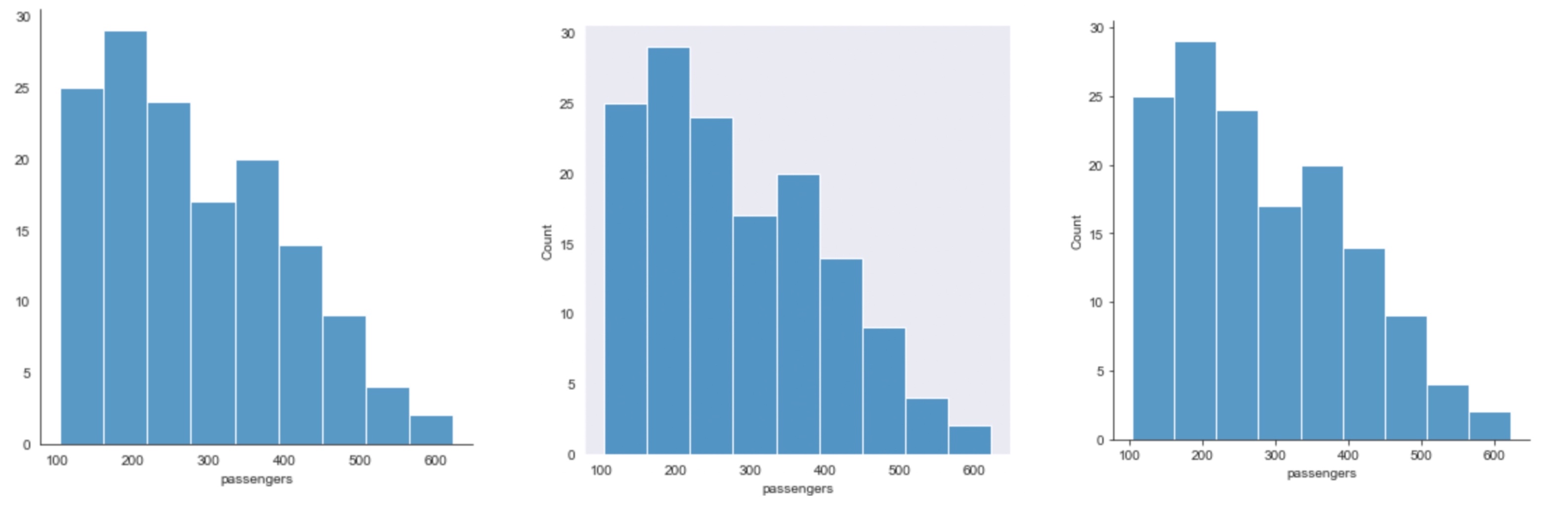
for style in ['white','dark','ticks']:
    sns.set_style(style)
    sns.displot(x='passengers',data=data)
    plt.show()
Output:
Removing Axis:
sns.displot(x='passengers',data=data)
sns.despine(left=True)
plt.show()
Output:
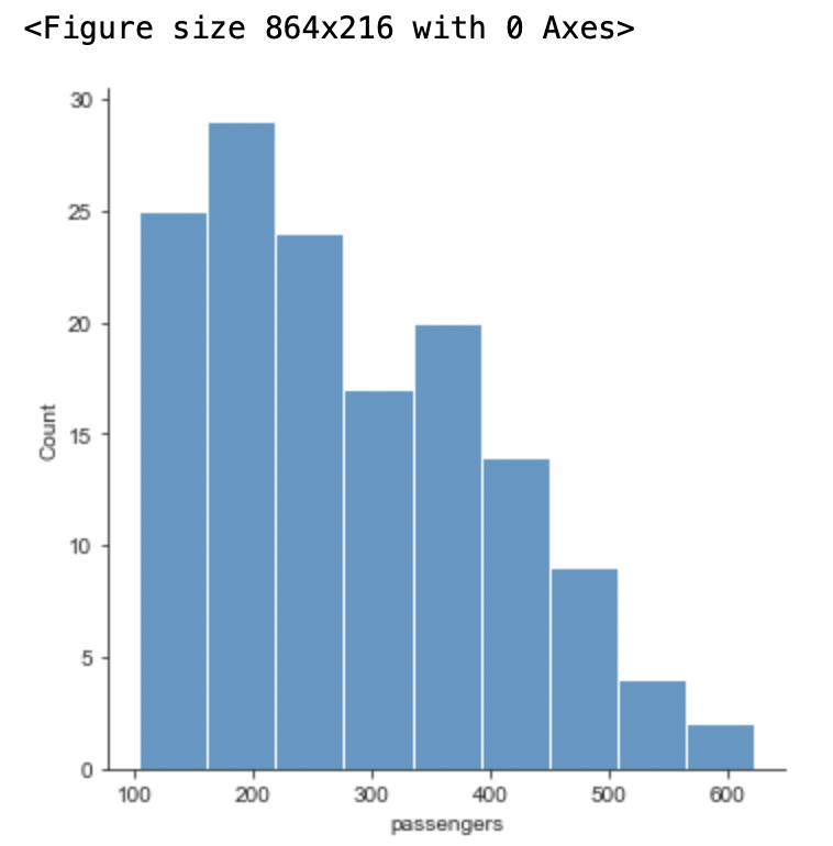
Customising Size:
#setting size
plt.figure(figsize =(12, 3))
sns.displot(x='passengers',data=data)
plt.show()
Output:
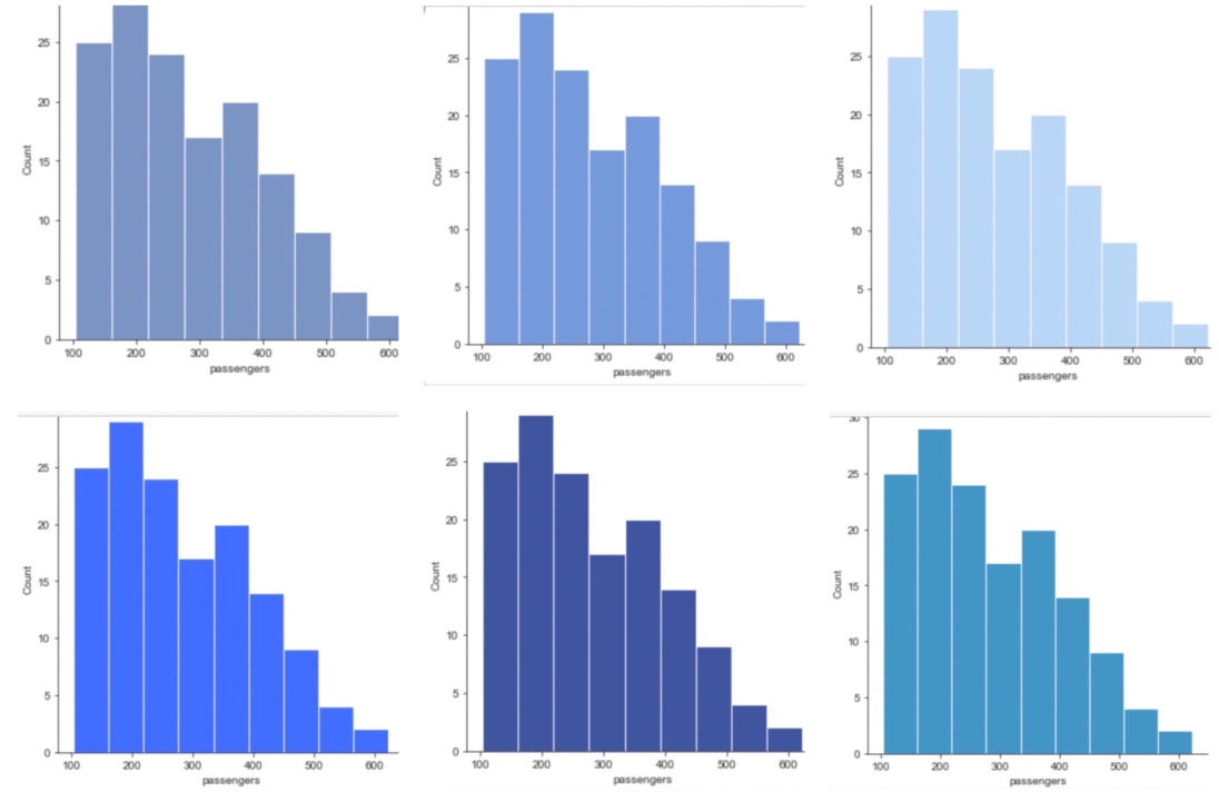
Setting Palette:
for p in sns.palettes.SEABORN_PALETTES:
    sns.set_palette(p)
    sns.displot(x='passengers',data=data)
    plt.show()
Output:
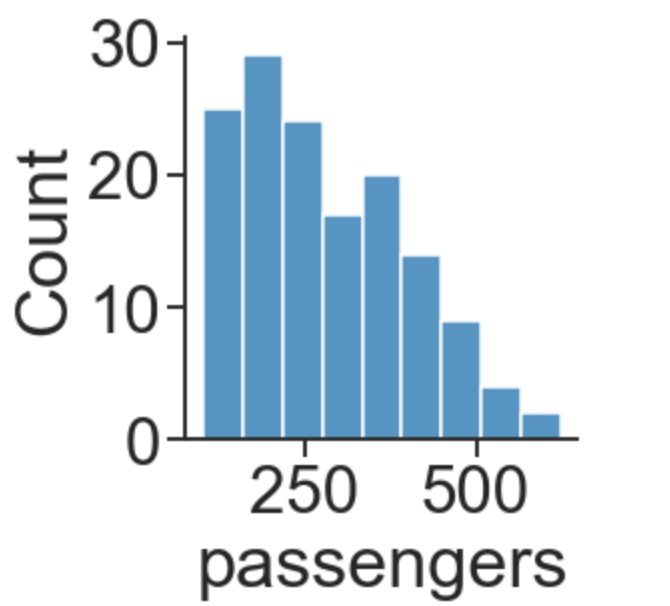
Using set_context
'''This affects things like the size of the labels,
lines, and other elements of the plot, but not the overall style.'''
sns.displot(x='passengers',data=data, palette='coolwarm')
sns.set_context('notebook', font_scale = 2)
plt.show()
Output:
- Log in to post comments