Box Plot can show the distribution of quantitative data in a way that shows the difference between variables or levels of categorical variables. Box Plot is also known as Whisker Plot. In Box Plot there is a line that indicates variables like the upper and lower quartiles, mean median maximum and minimum.
This function always treats one of the variables as categorical and draws data at ordinal positions (0, 1, … n) on the relevant axis, even when the data has a numeric or date type.
Here, the centre of the box shows the median value. The values from the bottom of the box show the first quartile. From the bottom of the box to the middle of the box lies the second quartile, and from the middle of the box to the top of the box lies the third quartile.
Syntax
seaborn.boxplot(*, x=None, y=None, hue=None, data=None,
order=None, hue_order=None, orient=None, color=None,
palette=None, saturation=0.75, width=0.8, dodge=True,
fliersize=5, linewidth=None, whis=1.5, ax=None, **kwargs)
Parameters:
- x,y: Input for plotting long-form data.
- data: Datasets for plotting.
- order, hue_order: It gives the order to plot the categorical levels.
- orient: It does the orientation of the plot that is vertically or horizontally.
- color: It is used for color for all of the elements.
- palette: It is used to show the different levels of the hue variable.
- fliersize: It is used for the size of the markers used to indicate outlier observations.
- linewidth: It is the width of the grey lines that frame the plot elements.
Example
import pandas as pd
import numpy as np
import matplotlib.pyplot as plt
import seaborn as sns

#loading the dataset
data = sns.load_dataset("taxis")
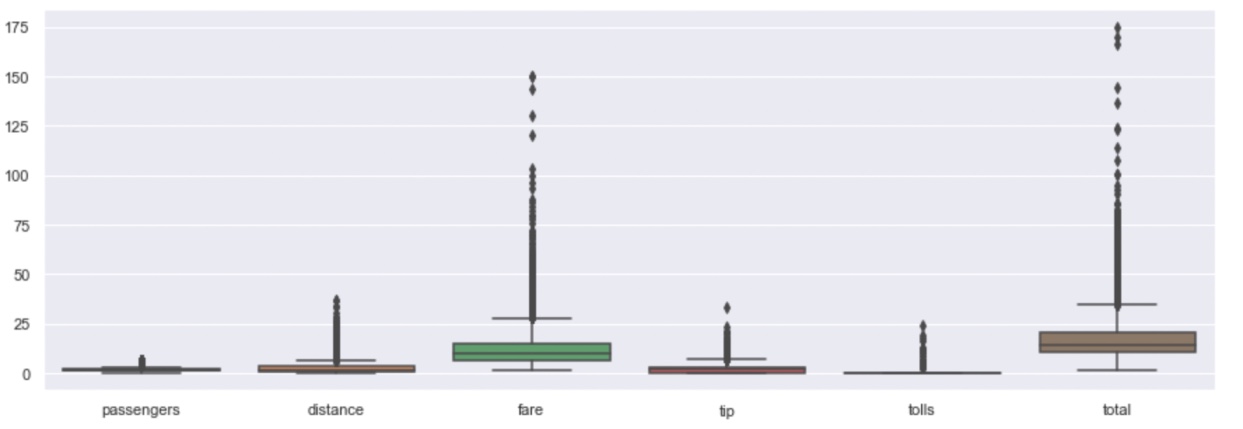
Creating a simple box plot for each of the numeric variables in the dataframe.
plt.figure(figsize=(15,5))
sns.boxplot(data=data)
Output
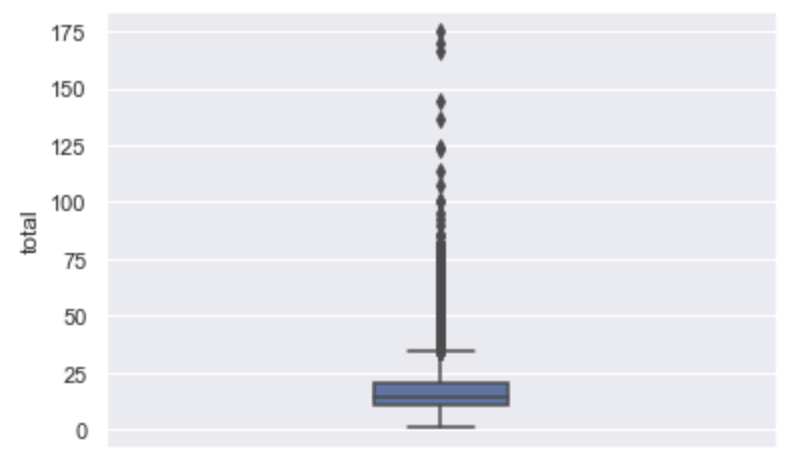
For total column
#SIMPLE box plot
sns.boxplot(y='total',data=data, width=0.2)
plt.show()
Output:
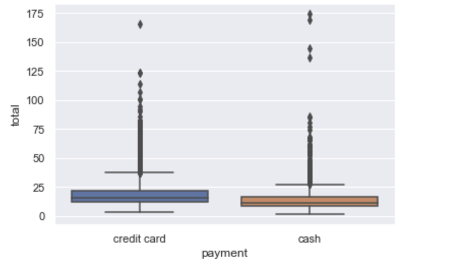
Creating a box plot for one numerical variables by using categorical variables.
sns.boxplot(x='payment',y='total',data=data)
plt.show()
Output:
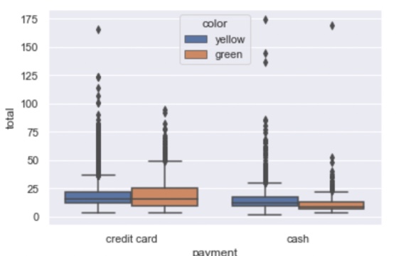
Creating a box plot for for one numerical and two categorical variable using hue attributes.
sns.boxplot(x='payment',y='total',hue='color',data=data)
plt.show()
Output:
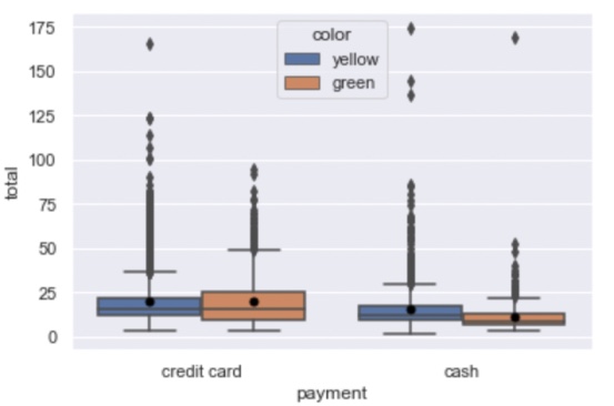
Using marker for mean in a box plot
sns.boxplot(x='payment',y='total',hue='color',data=data,showmeans=True,
meanprops={"marker":"o" ,"markerfacecolor":"black","markersize":"5" ,"markeredgecolor":"black"})
Output:
- Log in to post comments