Countplot is used to show the counts of observation in each categorical variable using bars. It basically works on the concept of a bar chart. It is one of the most simple plots provided by the seaborn library.
Syntax
seaborn.countplot(*, x=None, y=None, hue=None, data=None, order=None,
hue_order=None, orient=None, color=None, palette=None, saturation=0.75, dodge=True, ax=None, **kwargs)
Parameters:
- x,y: It is input for plotting the long-form of the data frame.
- hue: It takes the column for which we want to do color encoding.
- data: Datasets which is top be used for plotting the graph.
- order: It takes lists or strings. It is the order to plot the categorical levels in.
- orient: It is used for setting the orientation of the plot (horizontal or vertical).
- color: It is used to set the color for all of the elements.
- palette: It is used to set the color for a different level of hue variables.
- saturation: It is used for the proportion of the original saturation to draw colors at.
Examples
import pandas as pd
import numpy as np
import matplotlib.pyplot as plt
import seaborn as sns
data=sns.load_dataset('tips')
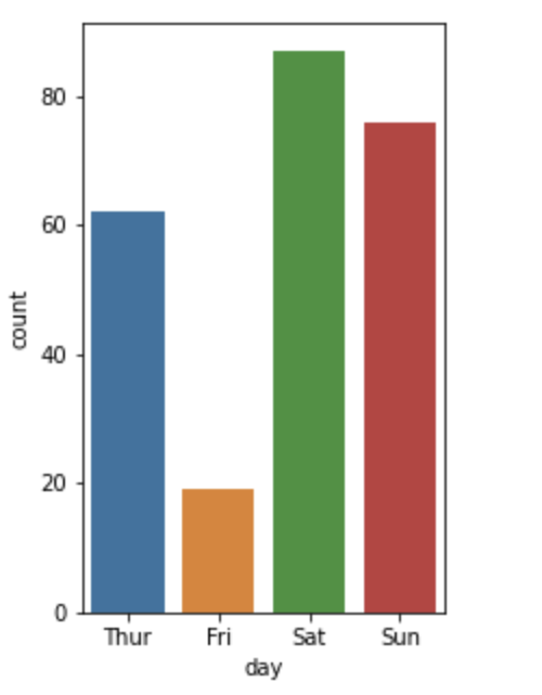
#countplot for a day column
plt.figure(figsize=(3,5))
sns.countplot(x='day', data=data)
Output
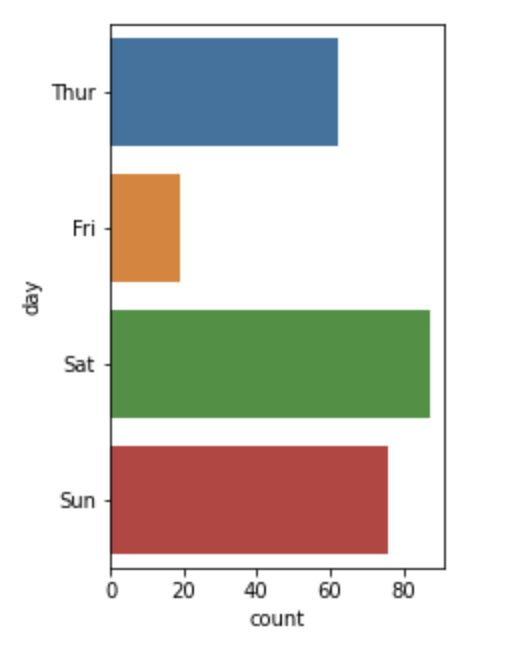
#along y-axis
plt.figure(figsize=(3,5))
sns.countplot(y='day', data=data_2)
Output:
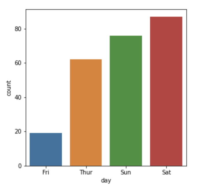
To plot count plot in ascending and descending order
Firstly we will check the index of the categorical value which we want to plot
data.day.value_counts().indexOutput:
CategoricalIndex(['Sat', 'Sun', 'Thur', 'Fri'], categories=['Thur', 'Fri', 'Sat', 'Sun'],
ordered=False, dtype='category')
#ascending order
plt.figure(figsize=(5,5))
sns.countplot(x='day', data=data, order=data.day.value_counts().index[::-1])
Output:
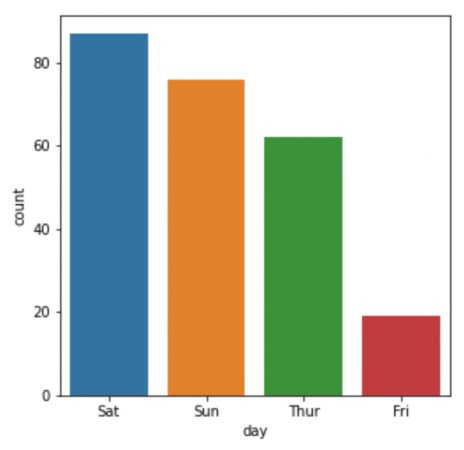
#descending order
plt.figure(figsize=(5,5))
sns.countplot(x='day',data=data,order=data.day.value_counts().index)
Output:
- Log in to post comments