Swarmplot is similar to a strip plot and a type of scatter plot. It is used for a better representation of categorical values. It is also used to avoid the overlapping of points. We use seaborn.swarmplot() to create such graphs.
Swarmplot is basically a categorical scatterplot with non-overlapping points.
Swarmplot can be drawn on its own but it is also a good complement to the box and violin plot when we want to show all the observations along with some representation of the underlying distribution.
Syntax
seaborn.swarmplot(*, x=None, y=None, hue=None, data=None, order=None,
hue_order=None, dodge=False, orient=None, color=None, palette=None, size=5,
edgecolor='gray', linewidth=0, ax=None, **kwargs)
Parameters:
- x,y, hue: It is input use for plotting long-from of data.
- data: It is the datasets or dataframe used for plotting the graph.
- order, hue_order: Order which is followed to plot the categorical levels.
- dodge: It is a bool. It is used in nesting
hue, If it is set toTruewill separate the strips for different hue levels along the categorical axis.
Examples
import pandas as pd
import numpy as np
import matplotlib.pyplot as plt
import seaborn as sns


data = sns.load_dataset("exercise")
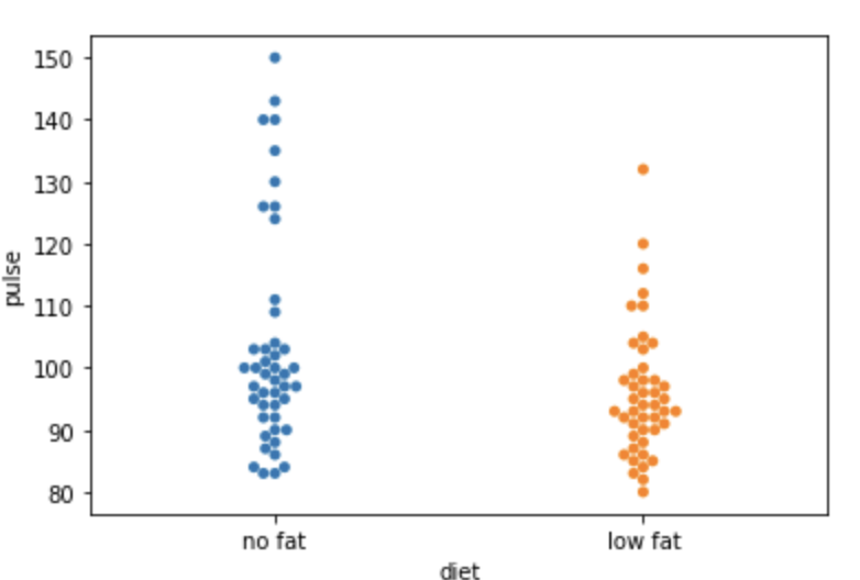
#simple swarmplot
sns.swarmplot(y='pulse', x='diet', data=data)
Output:
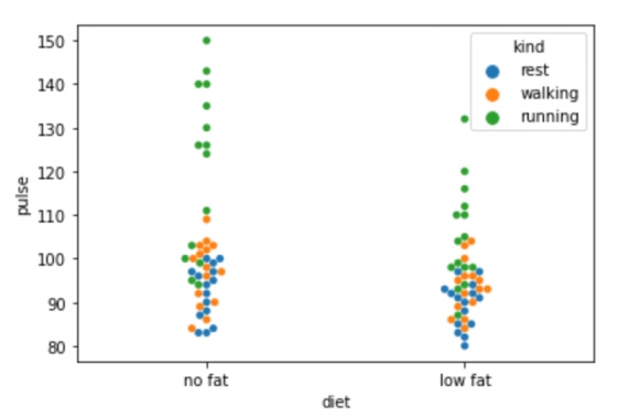
#using hue
sns.swarmplot(y='pulse', x='diet', hue='kind', data=data)
Output:
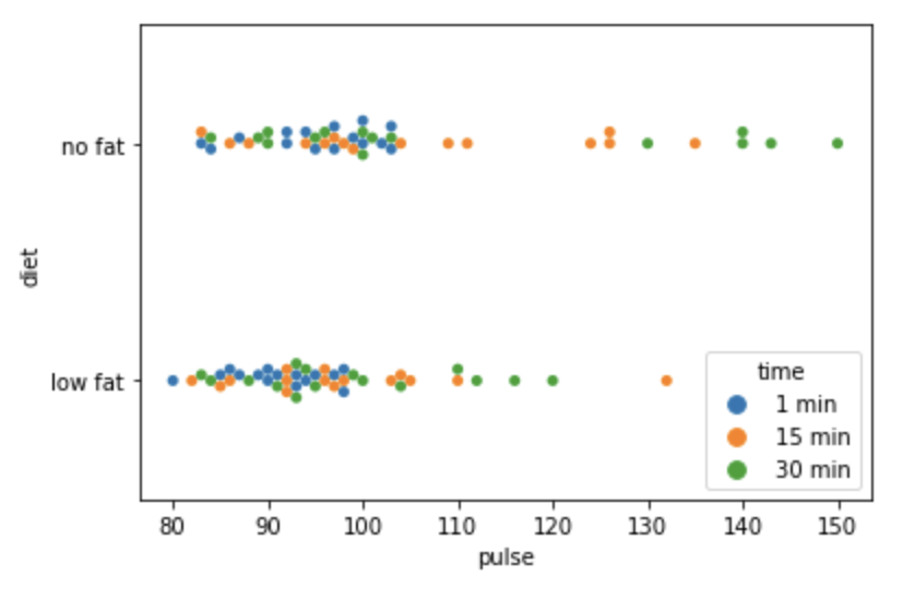
#orientation to h
sns.swarmplot(y = "diet", x = "pulse", hue = "time", orient = "h", data = data)
Output:
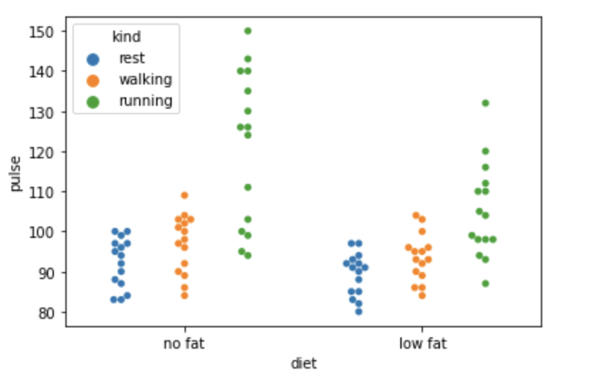
#dodge is set to True
sns.swarmplot(y='pulse', x='diet', hue='kind', data=data,dodge=True)
Output:
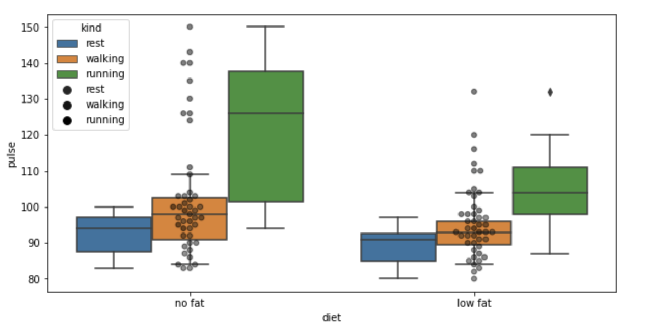
#swarmplot with boxplot
plt.figure(figsize=(10,5))
sns.boxplot(y='pulse', x='diet', hue='kind', data=data)
sns.swarmplot(y='pulse', x='diet', hue='kind', data=data,color='black',alpha=0.5,linewidth=1)
Output:
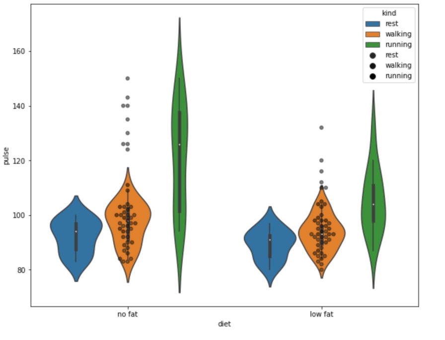
#swarmplot with violinplot
plt.figure(figsize=(10,8))
sns.violinplot(y='pulse', x='diet', hue='kind', data=data)
sns.swarmplot(y='pulse', x='diet', hue='kind', data=data,color='black',alpha=0.5,linewidth=1)
Output:
- Log in to post comments