Boxen Plot is used to draw an enhanced version of the box plot for larger datasets. This style of the plot was named "letter value" because it displays a large number of quantiles that are known as "letter value". By plotting more quartiles it becomes more informative about the shape of the distribution particularly in the tails.
Syntax
seaborn.boxenplot(*, x=None, y=None, hue=None, data=None, order=None,
hue_order=None, orient=None, color=None, palette=None, saturation=0.75,
width=0.8, dodge=True, k_depth='tukey', linewidth=None, scale='exponential',
outlier_prop=0.007, trust_alpha=0.05, showfliers=True, ax=None, **kwargs
Parameters:
- x,y: It is input for plotting long-from data
- data: It is used for input of Dataset for plotting.
- orient: It is used for the orientation of the plot (vertical or horizontal).
- color: It is the color for all of the elements.
- palette: It is the colors to use for the different levels of the hue variable.
- saturation: It is used as the proportion of the original saturation to draw colors at.
- dodge : When hue nesting is used, whether elements should be shifted along the categorical axis.
- outlier_prop : It is the proportion of data believed to be outliers.
- showfliers : It is a boolean value. If False, it will suppress the plotting of outliers.
Examples
import pandas as pd
import numpy as np
import matplotlib.pyplot as plt
import seaborn as sns
data = sns.load_dataset("taxis")
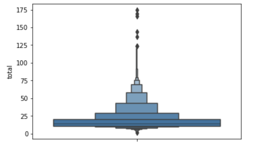
Creating a simple boxen plot
sns.boxenplot(y="total",data=data)
plt.show()
Output

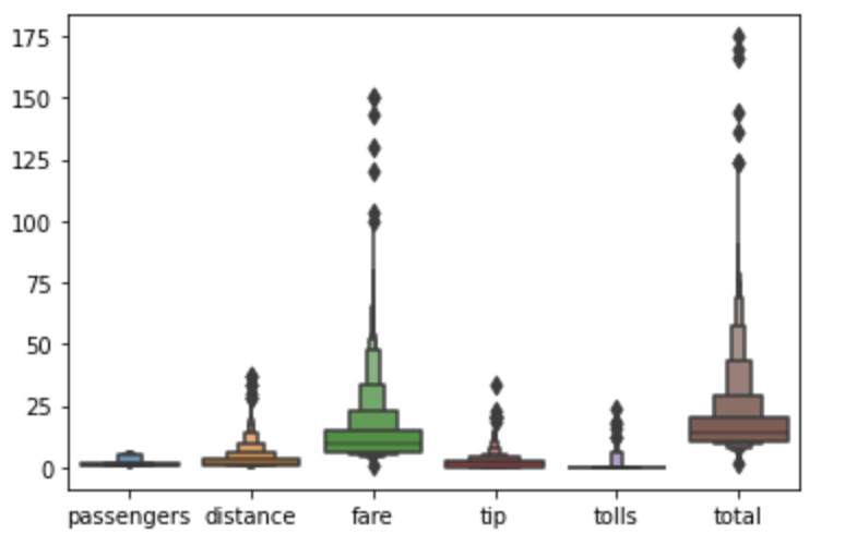
Creating a boxen plot for all the numerical variables present in the dataframe
sns.boxenplot(data=data)
plt.show()
Output:

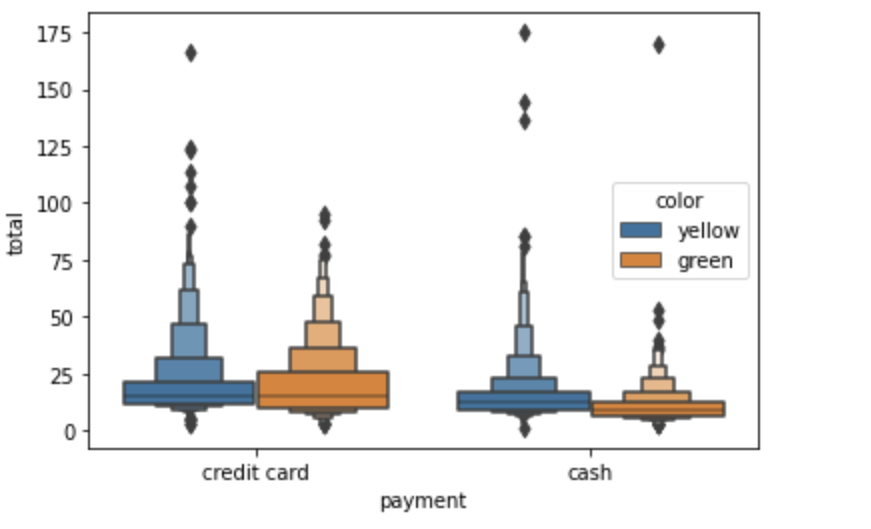
Creating a boxen plot for a numerical value and two categorical variables
sns.boxenplot(y="total",x='payment',hue='color',data=data)
plt.show()
Output:

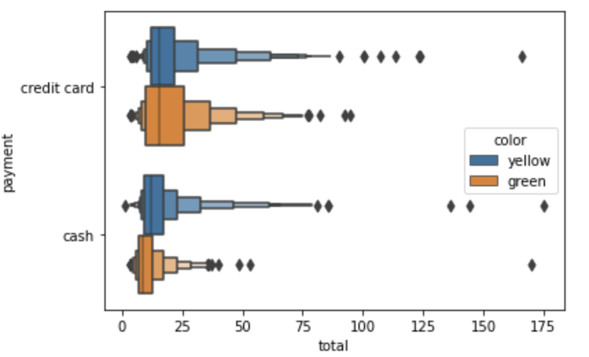
Creating boxen plot by using orientation which will be horizontally
sns.boxenplot(x="total",y='payment',hue='color',data=data, orient ="h")
plt.show()
Output:

- Log in to post comments