Violin Plot is similar to the box plot. Like a box plot, it also shows the distribution of data across several levels of one or more categorical values such that we can compare them.
This is a very effective way to show multiple data at several units. Violin Plot uses kernel density estimation for displaying underlying distribution.
It is used to draw a combination of boxplot and kernel density estimates.
Syntax
seaborn.violinplot(*, x=None, y=None, hue=None, data=None, order=None,
hue_order=None, bw='scott', cut=2, scale='area', scale_hue=True,
gridsize=100, width=0.8, inner='box', split=False, dodge=True, orient=None,
linewidth=None, color=None, palette=None, saturation=0.75, ax=None, **kwargs)
Parameters:
- x,y: Input for plotting long-form data.
- data: Datasets for plotting.
- cut: It is a type of distance, in units of bandwidth size, which is used to extend the density past the extreme datapoints.
- scale: It is used to scale the width of each violin.
- inner: It is used for the representation of the datapoints in the violin interior.
Examples
import pandas as pd
import numpy as np
import matplotlib.pyplot as plt
import seaborn as sns
#load the dataset
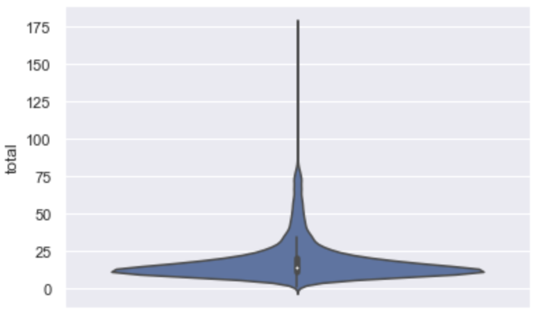
data = sns.load_dataset("taxis")Creating a simple Violin Plot
sns.violinplot(y="total",data=data)
plt.show()
Output:
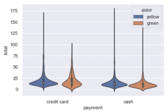
Creating a violin plot for one numerical and two categorical variables
sns.violinplot(x='payment',y='total',hue='color',data=data)
plt.show()
Output:
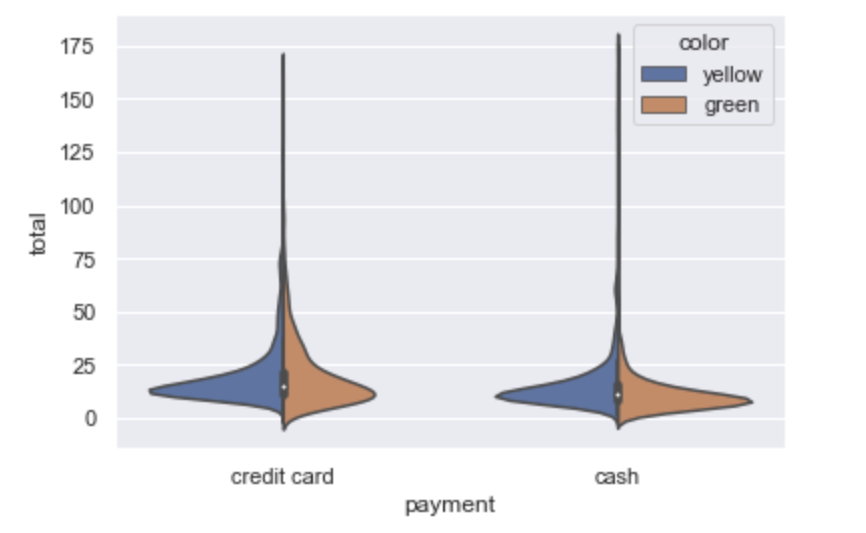
Use of split
sns.violinplot(x='payment',y='total',hue='color',data=data,split=True)
plt.show()
Output:
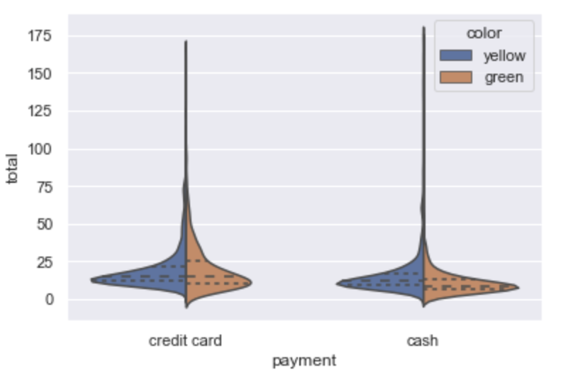
Changing the box present in violin plot to horizontal lines
sns.violinplot(x='payment',y='total',hue='color',data=data,split=True,inner='quartile')
plt.show()
Output:
- Log in to post comments