Scatter plot is used to plot a graph in which each datasets is represented by a dot. It is used observe relationship between given datasets.
The scatter() method is used to draw a scatter plot. It is generally used to represent relation among variables and how change in one affects the other.
Syntax
matplotlib.pyplot.scatter(x, y, s=None, c=None, marker=None, cmap=None, norm=None, vmin=None, vmax=None, alpha=None, linewidths=None, *, edgecolors=None, plotnonfinite=False, data=None, **kwargs)Parameters:
- x: Array containing x-axis data
- y: Array containing y-axis data
- s: Maker size in points. It can be scalar or array.
- c: Maker Color. It is a sequence of color.
- marker: The style of marker.
- cmap: It is colormap instances
- norm: Normalise By default: None
- vmin, vmax: It is used in conjunction with default norm to map the color array c to the colormap cmap
- linewidths- It is used to represent the width of marker border
- edgecolor- It is used to represent th marker border color
- alpha- It is used for blending value, between 0 (transparent) and 1 (opaque)
Example
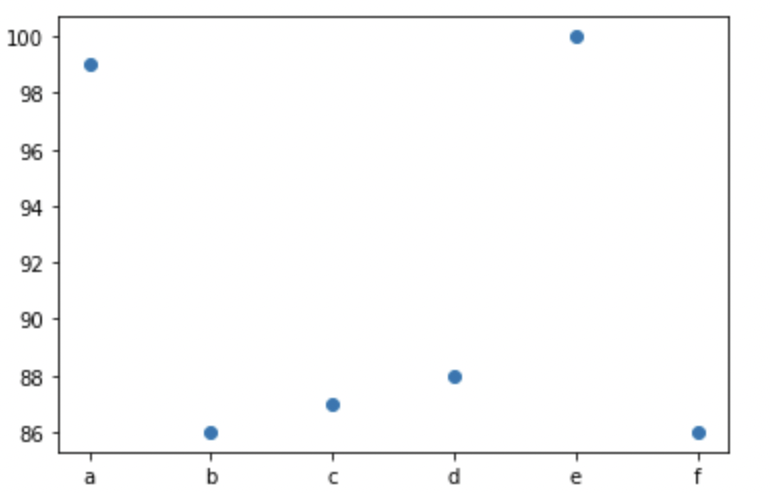
#import required library
import matplotlib.pyplot as plt
import numpy as np

#data for graph
x=np.array(['a','b','c','d','e','f'])
y=np.array([99,86,87,88,100,86])

plt.scatter(x, y)
plt.show()
Output
- Log in to post comments