Pie chart is used to display one serious of data. It is a circular statistical plot.
The area of chart depend upon the total percentage of the data. In this graph slice are known as wedge whose area can be determined by the lenght of the arc of the wedge. The functional area of each wedges is given by a/sum(data). Suppose if sum(a)<1 then the values of x will give fractional values thus the array will not be normalized.
Therefore the resulting pie will have an empty wedge of size1-sum(x)
It is used in business presentation like sales, operation, survey results resources, etc.
Syntax
plt.pie(data, explode=None, labels=None, colors=None, autopct=None, shadow=False)Parameter:
- data: It is basically the array whose elements are plotted on pie graph.
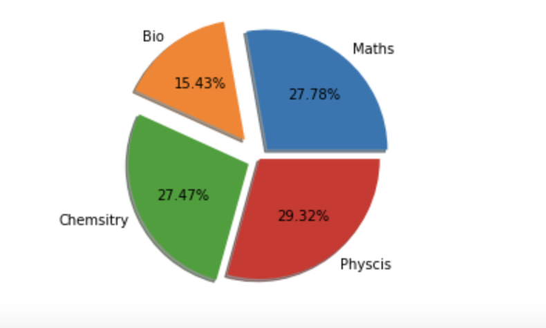
- explode: It is used to make a wedge stand out if required.
- label: The list whose elements are used as label for wedges in a pie chart.
- colors: It can be used to provide colours to wedges.
- autopct: The type of string which is used to label the numerical values on wedges.
- shadow: It is used to create a shadow.
Example
import numpy as np
import matplotlib.pyplot as plt
# creating the datasets
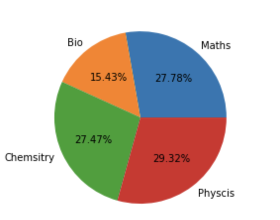
data={'Maths':90,'Bio':50,'Chemsitry':89,'Physcis':95}
subject=list(data.keys())
marks=list(data.values())
#creating pie plot
plt.pie(marks,labels=subject, autopct='%1.2f%%')
plt.show()Output:
If we have used explode and shadow then
my_explode = [0.1,0.2,0.1,0]
plt.pie(marks,labels=subject, explode=my_explode, autopct='%1.2f%%', shadow=True)
plt.show()
Output:
- Log in to post comments