Bar chart is a type of a graph which can represent categorical data with a rectangular bars in which height is proportional to the values that we want to represent. In this graph one axis represent the specfic categories which we want to compare and other is used to represent measured values of those categories.
It can be plotted horizontally and vertically. Here vertical bar chart is offten reffered as column chart.
It can describe the comparisons between discrete categories.
Syntax
plt.bar(x, height, width=0.8, bottom=None, *, align='center', data=None, **kwargs)Parameters:
- x: It implies x co-ordinates of the bars.
- height: It is used for height of the bars.
- bottom: The y co-ordinate of the bars.
- align: It is used for alignment.
Example
import numpy as np
import matplotlib.pyplot as plt
# creating the datasets
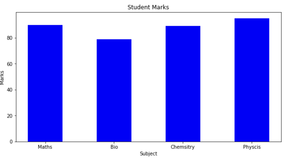
data={'Maths':90,'Bio':79,'Chemsitry':89,'Physcis':95}
subject=list(data.keys())
marks=list(data.values())
fig = plt.figure(figsize = (10, 5))
#creating bar plot
plt.bar(subject, marks, color ='blue', width = 0.5)
plt.xlabel("Subject")
plt.ylabel("Marks")
plt.title("Student Marks")
plt.show()Output:
- Log in to post comments