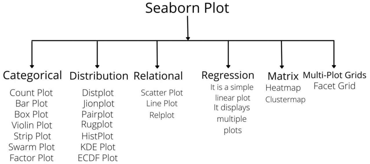
In Seaborn there are many types of plots some of them are:

Categorical Plots
- Count Plot: It counts the categories and returns a count of their occurrences. It is the simplest plot provided by the seaborn library.
- Barplot: It uses the height of a rectangle to represent an estimate of central tendency for a numeric variable and it also provide some uncertainty with the help of error bars.
- Box Plot: It is also known as the whiskers plot. It helps in maintaining the distribution of quantitative data in a way that do comparisons between variables or across the levels of a categorical variable.
- Violin Plot: It is similar to the box plot. It holds more information as compared to the box. It allows us to visualize the distribution of a numeric variable for one or several groups. It can be an effective and attractive way to show multiple data at several units.
- Strip Plot: It is a good complement to a boxplot or violin plot where all the observations can be plotted with some representation of the underlying distribution. It can also plot scatter plots based on category.
- Swarm Plot: It is similar to a strip plot. Here the points get adjusted and don't overlap each other this helps in better representation of the distribution of values.
- Factor Plot: It is used to draw different types of categorical plots. By using this function we can plot other seaborn categorical plots by using kind parameters, like box plots, violin plots, bar plots, or strip plots.
Distribution Plots
- Displot: It is basically used to observe a univariant set and visualizes with the use of histogram i.e. we have to choose only one particular column from the given datasets.
- Joint Plot: It is used to plot the two variables with bivariate and univariate graphs.
- Pair Plot: It is used for plotting multiple pairwise bivariate distributions in a dataset. It also shows the relationship for (n,2) types of combinations for the variables present in the given dataframe which is a matrix of plots and the diagonal plots are the univariate plots.
- Rug Plot: It is used for plotting marginal distributions by drawing ticks along the x and y axes.
- HistPlot: It is a classic visualization tool that represents the distribution of variables by counting the number of observations that fall within discrete bins.
- KDE Plot: It is the visualization tool that represents the distribution of observations in a dataset, analogous to a histogram. It represents the data by using a continuous probability density curve in one or more dimensions.
- ECDF Plot: It is used to represents the count of observations falling below under each unique value in a dataset.
Relational Plots
- Scatter Plot: It is generally used for several semantic groupings.
- Line Plot: We use a line plot with the possibility of several semantic groupings. The relation between x and y can be shown using different subsets of the hue, size, and style parameters.
- Relplot: It shows the relationships between two variables with semantic mappings of subsets.
Regression Plots
It creates a regression line between two parameters which helps to visualize their linear relationships.
Matrix Plots
- Heatmap: Heatmap is defined as a graphical representation of data using colours to visualize the value of the matrix.
- Clustermap: The clustermap() function of seaborn plots the hierarchically-clustered heatmap of the given matrix dataset.
Multi-Plot Grid
- FacetGrid: FacetGrid class helps in visualizing the distribution of one variable as well as the relationship between multiple variables separately within subsets of your dataset using multiple panels.
- Log in to post comments