In this article, we will learn to create our own custom palette. You can also refer to Seaborn: Color Palette to understand how this palette plays an important role in visualization.
We have three different types of color palettes in seaborn.
1. Qualitative
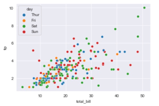
It is used for the categorical variables, whose colors get assigned to each group which need to be distinct. Each value of the variable is assigned one color from a qualitative palette within a plot.
Example
import seaborn as sns

data = sns.load_dataset('tips')
sns.set_style('darkgrid')
sns.scatterplot(x='total_bill', y='tip', data=data, hue='day')
Output
2. Sequential
In this, we can customize color of our own choice from darker shade to lighter shade or from lighter shade to darker shade. If the variables are assigned to be colored is numeric or has inherently ordered values, then it can be depicted with a sequential palette.
We can create this by using sns.light_palette() and sns.dark_palette().
Example
sns.light_palette('brown')Output

This light color palette will be based on one named color such as brown. So, this palette will start from light shade color and will go all the way to what color you have given. It will give a sequential palette here. This palette contains a varying shade of just one color.
sns.dark_palette('brown')Output

Here it has started with the dark shade and will go up to that named color.
3. Diverging
It works best on the mixed values when we have both +ve and -ve values present in the datasets.
We can create this by using sns.blend_palette().
Example
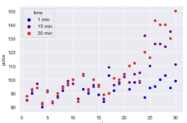
sns.blend_palette(['brown', 'crimson','yellow'])Output

Here, we will give a list of color as an argument that will blend the color between all the colors passed as a list.
sns.blend_palette(['brown', 'crimson','yellow'],10)Output

We can also pass the integer to get as many shades as we want.
import seaborn as sns

data=sns.load_dataset('exercise')
sns.set_style('darkgrid')

#this is how we will apply these custom color palette to our plots for visualization
sns.scatterplot(x='id', y='pulse', data=data, hue='time',
                palette=sns.blend_palette(['blue','red'],3))
Output
- Log in to post comments