Regression plots, as the name suggests are used to perform regression analysis between two or more variables.The dataset that we are going to use for this section is the "diamonds" dataset which is downloaded by default with the seaborn library. Execute the following script to load the dataset:
import pandas as pd
import numpy as np

import matplotlib.pyplot as plt
import seaborn as sns

dataset = sns.load_dataset('diamonds')

dataset.head()
The dataset looks like this:
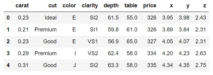
The dataset contains different features of a diamond such as weight in carats, color, clarity, price, etc.
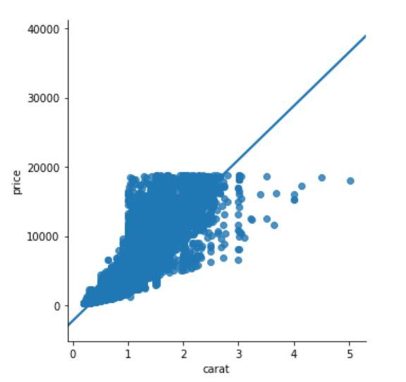
Let's plot a linear relationship between, carat and price of the diamond. Ideally, the heavier the diamond is, the higher the price should be. Let's see if this is actually true based on the information available in the diamonds dataset.
To plot the linear model, the lmplot() function is used. The first parameter is the feature you want to plot on the x-axis, while the second variable is the feature you want to plot on the y-axis. The last parameter is the dataset. Execute the following script:
sns.lmplot(x='carat', y='price', data=dataset)
The output looks like this:
You can also plot multiple linear models based on a categorical feature. The feature name is passed as value to the hue parameter. For instance, if you want to plot multiple linear models for the relationship between carat and price feature, based on the cut of the diamond, you can use lmplot function as follows:
sns.lmplot(x='carat', y='price', data=dataset, hue='cut')
The output looks like this:
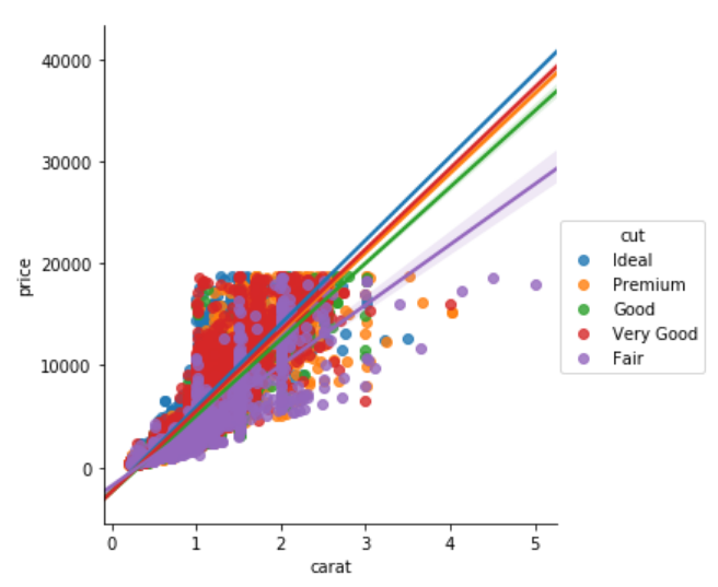
From the output, you can see that the linear relationship between the carat and the price of the diamond is steepest for the ideal cut diamond as expected and the linear model is shallowest for fair cut diamond.
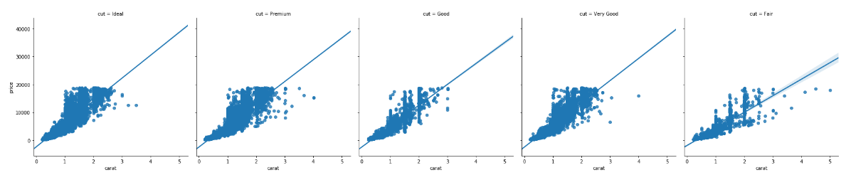
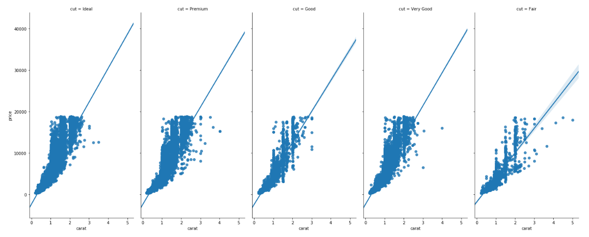
In addition to plotting the data for the cut feature with different hues, we can also have one plot for each cut. To do so, you need to pass the column name to the cols attribute. Take a look at the following script:
sns.lmplot(x='carat', y='price', data=dataset, col='cut')
In the output, you will see a separate column for each value in the cut column of the diamonds dataset as shown below:
You can also change the size and aspect ratio of the plots using the aspect and size parameters. Take a look at the following script:
sns.lmplot(x='carat', y = 'price', data= dataset, col = 'cut', aspect = 0.5, size = 8 )
The aspect parameter defines the aspect ratio between the width and height. An aspect ratio of 0.5 means that the width is half of the height as shown in the output.
You can see through the size of the plot has changed, the font size is still very small. In the next section, we will see how to control the fonts and styles of the Seaborn plots.
- Log in to post comments