Heat maps are normally used to plot correlation between numeric columns in the form of a matrix. It is important to mention here that to draw matrix plots, you need to have meaningful information on rows as well as columns. Continuing with the theme from teh last article, let's plot the first five rows of the Titanic dataset to see if both the rows and column headers have meaningful information. Execute the following script:
import pandas as pd
import numpy as np

import matplotlib.pyplot as plt
import seaborn as sns

dataset = sns.load_dataset('titanic')

dataset.head()
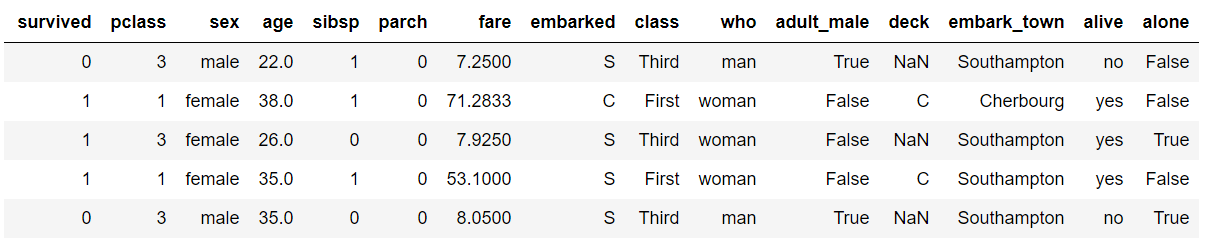
From the output, you can see that the column headers contain useful information such as passengers survived, their age, fare etc. However the row headers only contains indexes 0, 1, 2, etc. To plot matrix plots, we need useful information on both columns and row headers. One way to do this is to call the corr() method on the dataset. The corr() function returns the correlation between all the numeric columns of the dataset. Execute the following script:
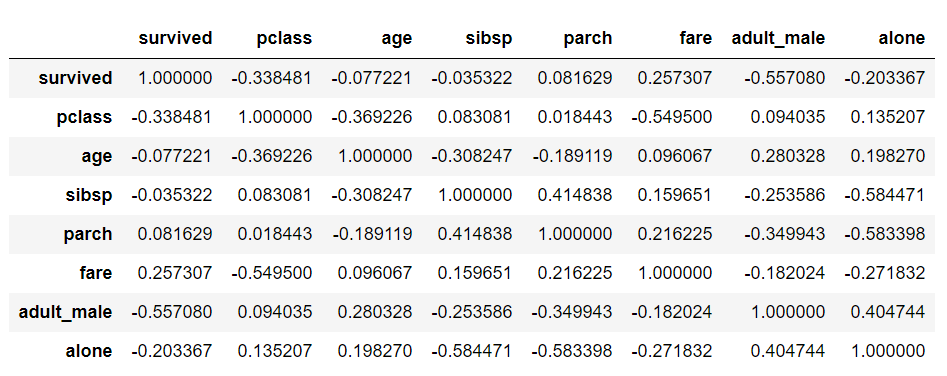
dataset.corr()
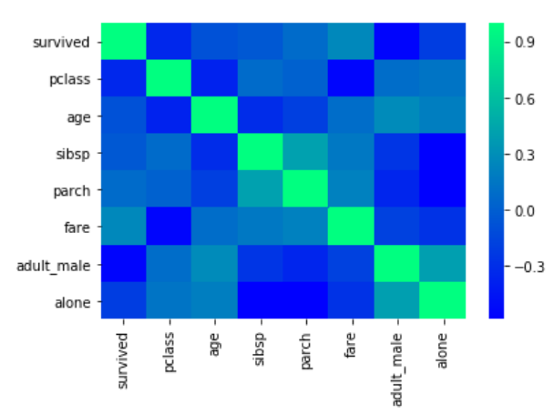
In the output, you will see that both the columns and the rows have meaningful header information, as shown below:
Now to create a heat map with these correlation values, you need to call the heatmap() function and pass it your correlation dataframe. Look at the following script:
corr = dataset.corr()
sns.heatmap(corr)
The output looks like this:
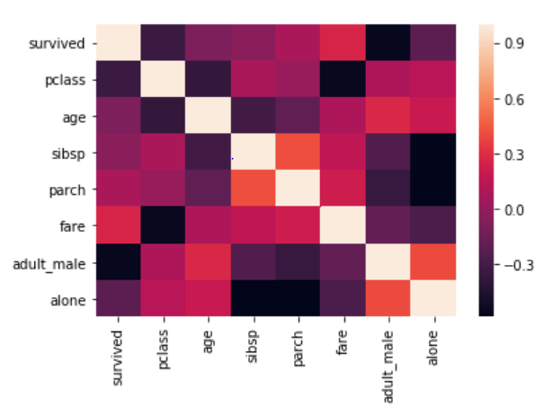
From the output, it can be seen that what heatmap essentially does is that it plots a box for every combination of rows and column value. The color of the box depends upon the gradient. For instance, in the above image if there is a high correlation between two features, the corresponding cell or the box is white, on the other hand if there is no correlation, the corresponding cell remains black.
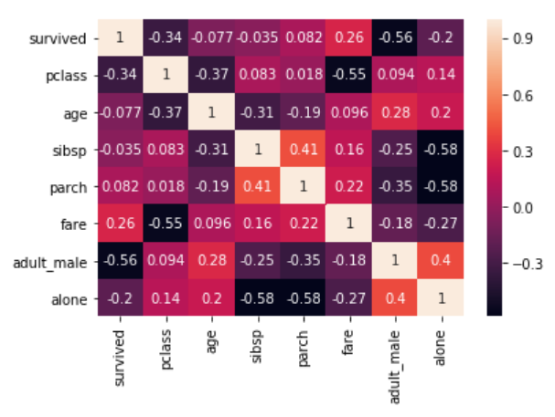
The correlation values can also be plotted on the heatmap by passing True for the annot parameter. Execute the following script to see this in action:
corr = dataset.corr()
sns.heatmap(corr, annot=True)
Output:
You can also change the color of the heatmap by passing an argument for the cmap parameter. For now, just look at the following script:
corr = dataset.corr()
sns.heatmap(corr, cmap='winter')
The output looks like this:
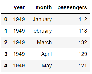
In addition to simply using correlation between all the columns, you can also use pivot_table function to specify the index, the column and the values that you want to see corresponding to the index and the columns. To see pivot_table function in action, we will use the "flights" data set that contains the information about the year, the month and the number of passengers that traveled in that month.
Execute the following script to import the data set and to see the first five rows of the dataset:
import pandas as pd
import numpy as np

import matplotlib.pyplot as plt
import seaborn as sns

dataset = sns.load_dataset('flights')

dataset.head()
Output:
Now using the pivot_table function, we can create a heat map that displays the number of passengers that traveled in a specific month of a specific year. To do so, we will pass month as the value for the index parameter. The index attribute corresponds to the rows. Next we need to pass year as value for the column parameter. And finally for the values parameter, we will pass the passengers column. Execute the following script:
data = dataset.pivot_table(index='month', columns='year', values='passengers')
sns.heatmap(data)
The output looks like this:
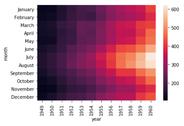
It is evident from the output that in the early years the number of passengers who took the flights was less. As the years progress, the number of passengers increases.
Currently, you can see that the boxes or the cells are overlapping in some cases and the distinction between the boundaries of the cells is not very clear. To create a clear boundary between the cells, you can make use of the linecolor and linewidths parameters. Take a look at the following script:
data = dataset.pivot_table(index='month', columns='year', values='passengers' )
sns.heatmap(data, linecolor='blue', linewidth=1)
In the script above, we passed "blue" as the value for the linecolor parameter, while the linewidth parameter is set to 1. In the output you will see a blue boundary around each cell:
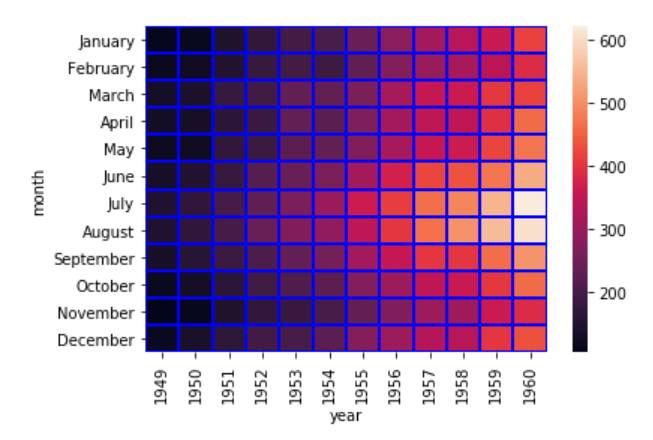
You can increase the value for the linewidth parameter if you want thicker boundaries.
- Log in to post comments