KDE Plot is known as Kernel Density Estimate Plot which is generally used for estimating the e Probability Density function of a continuous variable.
It is a method for visualizing the distribution of observations in a dataset, analogous to a histogram. It represents the data using a continuous probability density curve in one or more dimensions.
Here, we can plot for the univariate or multiple variables altogether.
Basically, in statistics, kernel density estimation (KDE) is a non-parametric way to estimate the probability density function (PDF) of a random variable.
Syntax
seaborn.kdeplot(x=None, *, y=None, shade=None, vertical=False, kernel=None,
bw=None, gridsize=200, cut=3, clip=None, legend=True, cumulative=False,
shade_lowest=None, cbar=False, cbar_ax=None, cbar_kws=None, ax=None,
weights=None, hue=None, palette=None, hue_order=None, hue_norm=None,
multiple='layer', common_norm=True, common_grid=False, levels=10,
thresh=0.05, bw_method='scott', bw_adjust=1, log_scale=None, color=None,
fill=None, data=None, data2=None, warn_singular=True, **kwargs)
Parameters:
- x,y: x and y are variables that specify the position along the x and y-axis.
- vertical, kernel, bw: It is Deprecated since version 0.11.0.
- cumulative: It is a bool value. If True, It will estimate a cumulative distribution function.
- shade_lowest: It is a bool value. If False, the area below the lowest contour will be transparent.
- cbar: It is a bool value. If True, It adds a colorbar to annotate the color mapping in a bivariate plot.
- multiple: It is a method for drawing multiple elements when semantic mapping creates subsets.
- data: Input datasets.
- warn_singular: It is a bool value. If True, it will issue a warning when trying to estimate the density of data with zero variance.
Examples
Import the libraries we will use.
import seaborn as sns
import matplotlib.pyplot as plt
import pandas as pd
Load the datasets which will be used for plotting the plot.
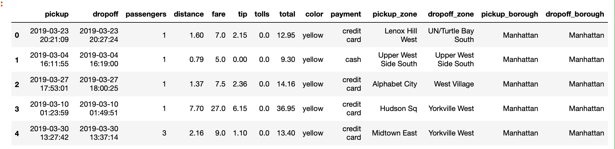
data=sns.load_dataset("taxis")
data.head(5)
Output:
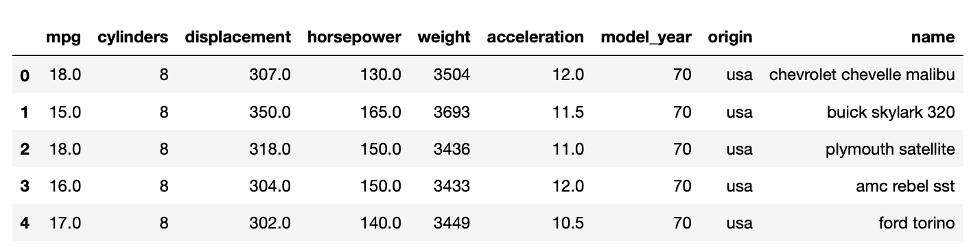
Another dataset
data_1= sns.load_dataset("mpg")
data_1.head(5)
Output:
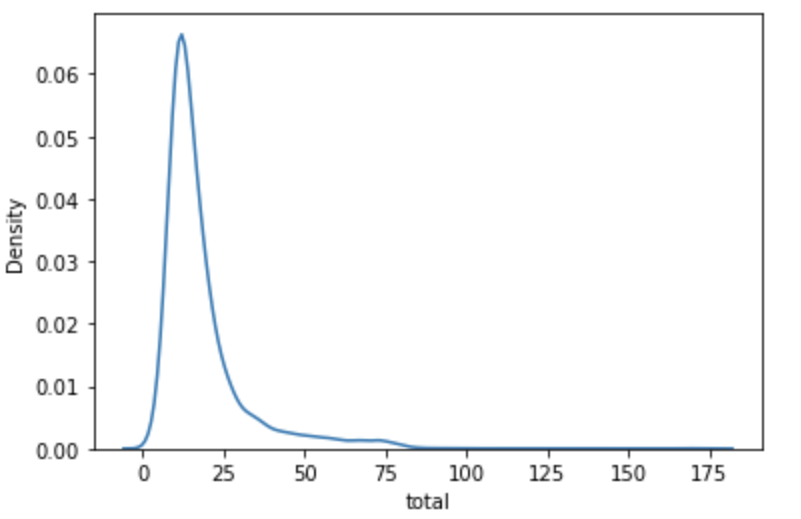
Create a KDE Plot for total column.
#KDE plot for total column
sns.kdeplot(data=data, x='total')
plt.show()
Output:
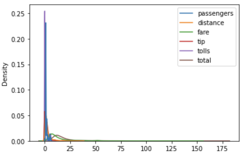
Create KDE Plot for all the numerical values present in the dataframe
#KDE Plot for all the numeric variables in dataframe
sns.kdeplot(data=data)
plt.show()
Output:
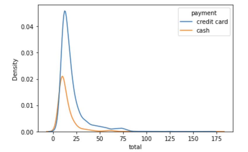
Grouping in KDE Plot using category value.
#Grouping the KDE on a category variable
sns.kdeplot(data=data,x="total",hue='payment')
plt.show()
Output:
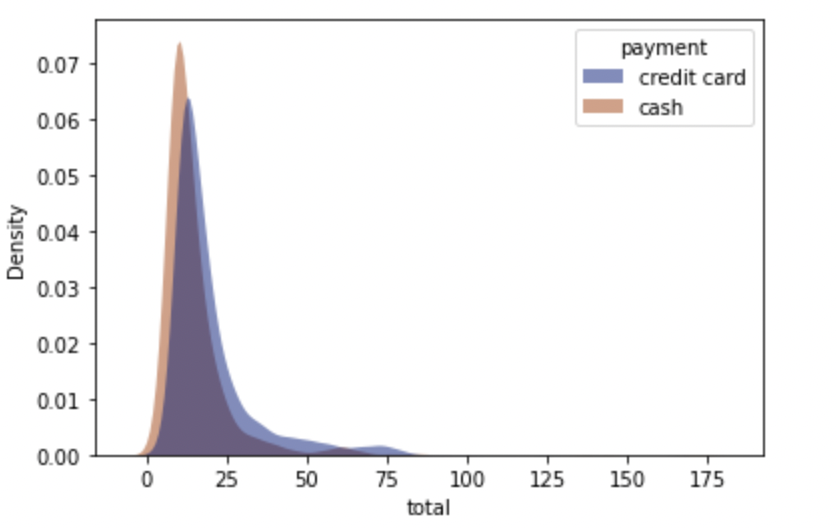
Styling the KDE Plot.
#styling the kde plot
sns.kdeplot( data=data, x="total", hue="payment",fill=True, common_norm=False,
palette="dark",alpha=.5, linewidth=0,)
plt.show()
Output:
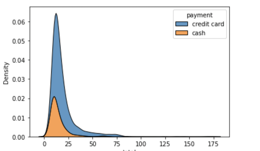
Stacking the KDE Plot on a category using MULTIPLE arguement
#stacked KDE Plot
sns.kdeplot(data=data,x='total',hue='payment',multiple='stack')
plt.show()
Output:
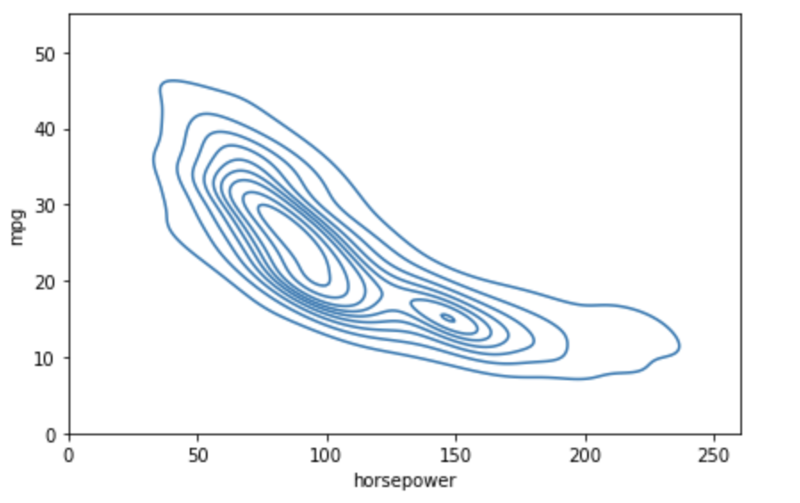
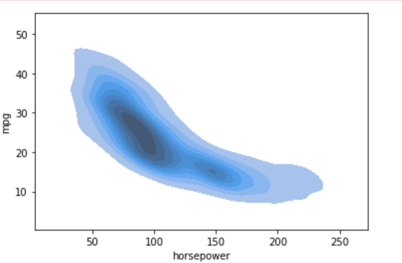
For bivariate KDE Plot
# create a bivariate KDE Plot
sns.kdeplot(data_1.horsepower, data_1.mpg)
plt.xlim(0, 260)
plt.ylim(0, 55)
plt.tight_layout()
plt.show()
Output:
Using Shade:
sns.kdeplot(data_1.horsepower,data_1.mpg, shade=True)
plt.show()
Output:
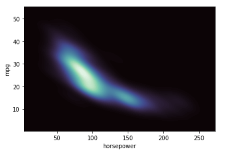
Fill the axes extent with a smooth distribution, using a different colormap
sns.kdeplot(data_1.horsepower,data_1.mpg,
    fill=True, thresh=0, levels=100, cmap="mako",)
plt.show()
Output:
- Log in to post comments