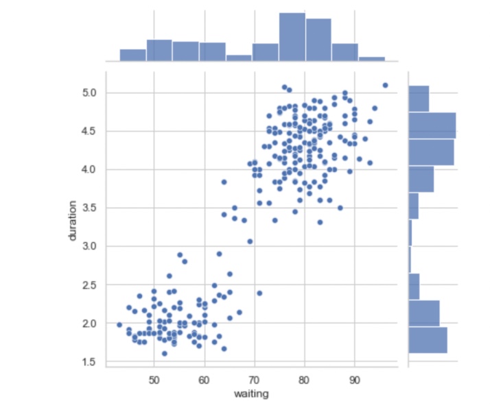
The joint plot is the concise way of understanding the relationship between two variables as well as the individual distribution of each variable.
The Joint plot is consists of 3 separate plots. In which one is the middle figure which is used to see the relationship between x and y. This area gives us information about the joint distribution while the other two areas give us marginal distribution for the x and y-axis.
Syntax
seaborn.jointplot(x, y, data=None, kind=’scatter’, stat_func=None, color=None, height=6, ratio=5, space=0.2, dropna=True, xlim=None, ylim=None, joint_kws=None, marginal_kws=None, annot_kws=None, **kwargs)Parameters
- x,y: Variables that specify x-axes and y-axes.
- data: The input datasets.
- kind: The kind of plot to draw.
- color: The parameter used to take Color for the plot elements.
- space: The space between a joint distribution and marginal distribution.
- xlim, ylim: The limit of x and y-axis.
Example
import pandas as pd
import seaborn as sns
import matplotlib.pyplot as plt
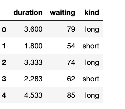
data = sns.load_dataset("geyser")
data.head(5)
Output
sns.jointplot(x='waiting', y='duration', data=data)
plt.show()
Output:
- Log in to post comments